Work
Discovery / Research / Implementation QA
The company, a SaaS platform with a mature Ember.js frontend, faced challenges maintaining and scaling their product. Modernizing to React offered:
As the lead product designer, I worked closely with engineering to ensure our approach balanced user experience, accessibility, and operational efficiency.
However, we quickly encountered a migration bottleneck:
The lack of a mature, consistent component library was slowing the migration — pushing timelines and increasing operational costs.
Our goal was to accelerate the React migration by creating a design system that balanced developer speed, accessibility, and brand consistency.
We wanted a system that:
As the sole designer, I was respondsible to work with engineers and managers to conduct research and discover forthe desired outcomes for the design system and what we can do better. I was responsible for the execution of the visual assets and documentation
When I joined Thrive, Inherited an undocumented group of bootstrap components that would quickly buckle under the weight of designs. Over my first year I used Atomic Design Principles to standardize typography and colours to create/update reusable components to increase consistency across design and implementation. However the inherited components themselves were brittle and did not cascade, and as a result it was costly to make even minor adjustments to fix errors in the components.

Our initial plan was to pair React with Tailwind CSS, leveraging its utility-first approach to build a fresh, modern UI. It aligned well with our Design System Vision Statement:
To esablish a lightweight, utility-first design system that empowers developers to build accessible, consistent, and scalable UI componenets with flexibility - enabling faster delivery during the Ember-to-React migration while laying the groundwork for a robust long-term design language.
We envisioned a design system that:
Tailwind's configurability allowed us to define design tokens (e.g. spacing, colour palette, typography, border radius etc) that matched both our branding and the look and feel users were accustomed to.
While the approach gave us flexibility and design control we experienced bottlenecks as the business grew and sprints became feature focused.
The rapidly evolving buisness needs revealed that we needed a more scalable, opionated solution that didn't compromise quality or delivery speed.
This realization led us to evaluate component libraries that could bridge the gap between control and speed - ultimately guiding us toward Mantine
Ship faster, without compromising accessibility or maintainability.
As a SaaS startup, we needed to reduce operational complexity and move quickly — especially as our customer base expanded and feature demands accelerated.
We set out to find a component library that would:
We compared several leading React UI llibraries based on:

Mantine hit the sweet spot:
Feautre velocity noticeable improved - product teams were able to deliver new pages and flows in significantly less time
Reusable, styled, and accessible components meant less review time from design and QA - freeing teams to focus on higher leverage work.
Feautre velocity noticeable improved - product teams were able to deliver new pages and flows in significantly less time
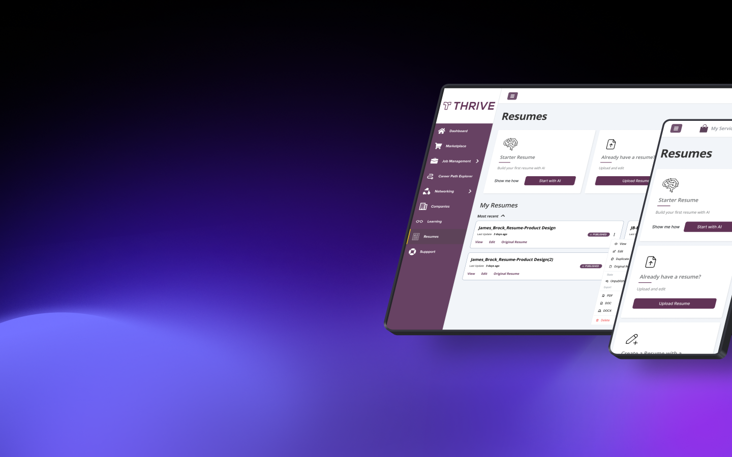
Using the Mantine UI kit as a baseline, each component was meticulously analyzed and optimized to modernize our previous look and feel while minimizing the engineering effort to deploy components.

Using the Mantine UI kit as a baseline, each component was meticulously analyzed and optimized to modernize our previous look and feel while minimizing the engineering effort to deploy components.


A design system is the source of truth for your company's visual design language. Working closely with front-end engineers to realize their main goals for the design system:

A design system is more that just a UI kit. Every UI component would have detailed usage documentation for designers, engineers or any team member to understand. Mantine components allows for design updates to base components that align closer to the original brand while maintaining a updated and modern poslished feel.

Design tokens are an integral part to creating a cross-functional design system. I worked with the engineers to understand the naming conventions fo their CSS classes. Using those classes I was able to construct design tokens that would easily match those CSS classes to create value for both designers and engineers.
Feautre velocity noticeable improved - product teams were able to deliver new pages and flows in significantly less time
Reusable, styled, and accessible components meant less review time from design and QA - freeing teams to focus on higher leverage work.
Feautre velocity noticeable improved - product teams were able to deliver new pages and flows in significantly less time

