Work
Research | Wireframing | High-Fidelity Mockups | Prototyping | Testing | QA
In 2023, Thrive commited to building a feature to connect employers to its wide user base and talent pool. However, roughly only 1 in 5 users either upload or create their resume on Thrive, leaving a huge gap in our searchable talent pool. This put our talent exchange feature at risk.
The timeline to increase resume intake to the platform was short, and our task was to quickly locate a root cause and design an elegant and simple solution to match talent with employers.
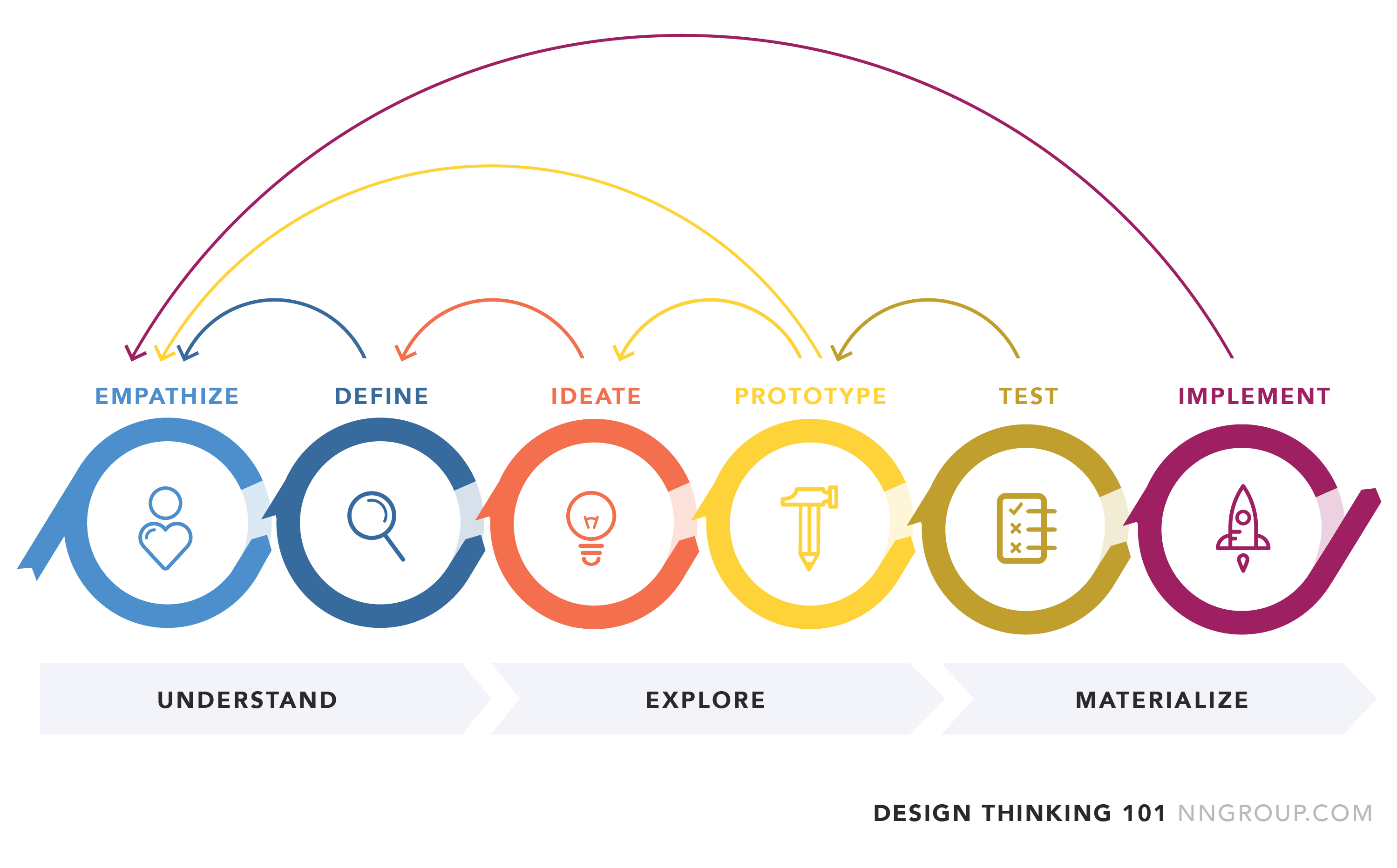
We followed a flexible design thinking approach to rapidly identify and act on the Resumbe Builder tool's pain points.
Data showed users reached the Resume Builder page, but rarely continued. Qualitative feedback from users, Career Coaches and Service Providers revealed a lack of motivation and clarity. We reframed the issue: the tool wasn't broken - the introduction wasn't earning user attention or trust.
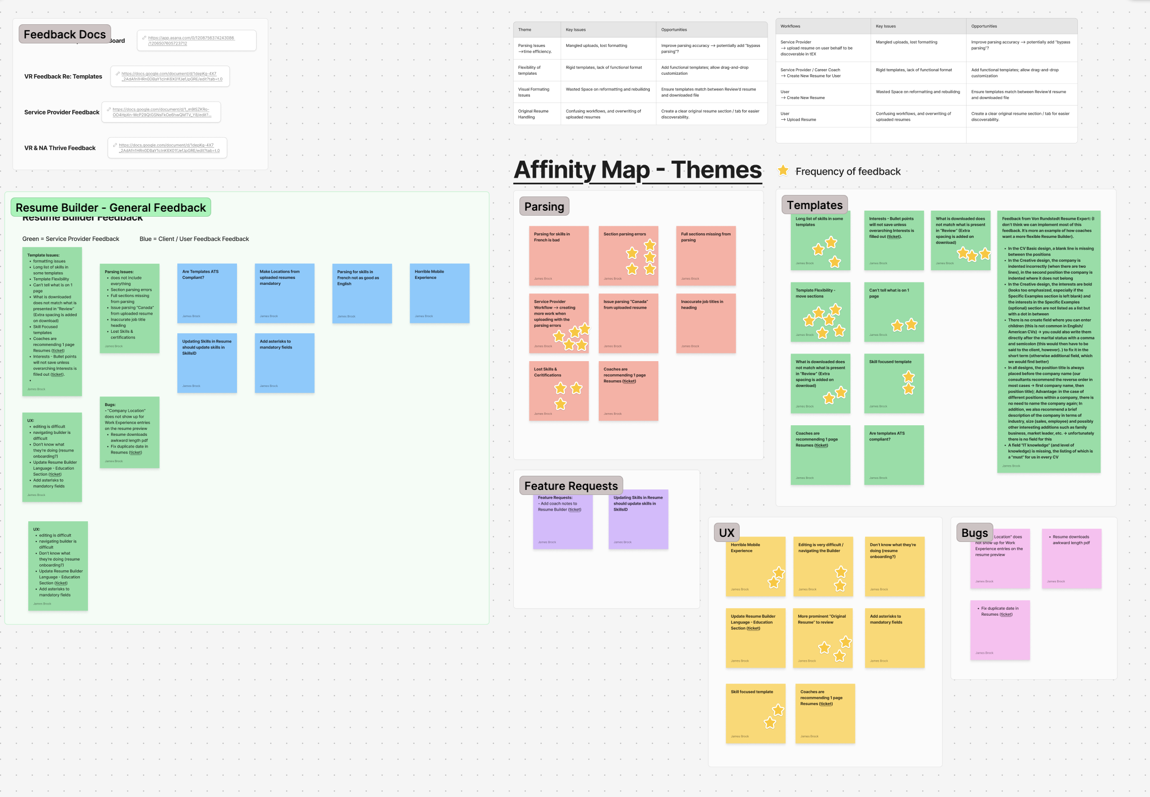
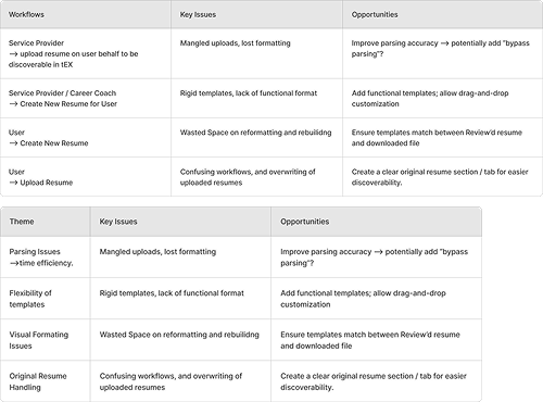
Without a complete gut and overhaul of our Resume Builder feature and workflow, resume parsing was the highest impact on our Action Priority Matrix that we could solve for within the time constraints. However, parsing alone would not solve the low user interaction on our Resume Builder feature.
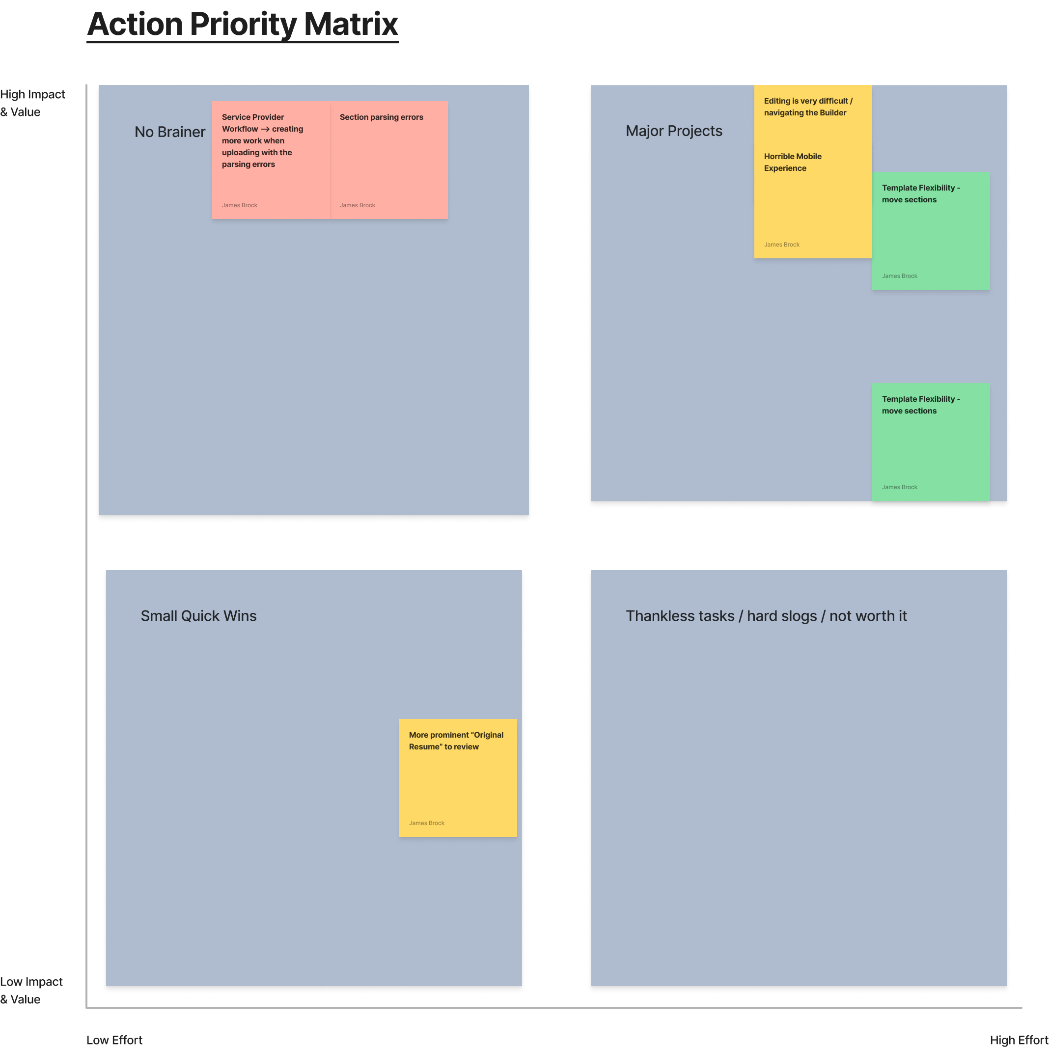
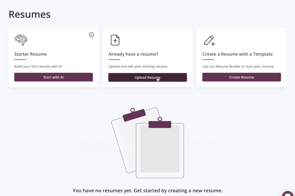
We needed a solution that reached across our wide array of personas; from tech savy users who already have a resume and tailored resume workflow, to inactive job seekers who have never created a resume. Diving into our data we found that the first page of our Resume Builder had very low page session durations and a very high bounce rate. We hypothesized that first time users were not engaging with the initial Resume Builder screen due to its complexity causing cognitive overload and any perceived value past creating a new resume would bring.
How might we reduce the friction of getting users to upload/create resumes to Thrive so that they are able to understand the value it brings?
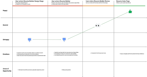
After mapping the current user journey in our Resume Builder, we identified the main friction points and decided to proceed to solve the lowest hanging fruit for an interative improvement.
By updating the Resumes Index page and using it at the starting point in the flow, users were not overwhelmed by the page and had clear workflows to choose from.
With this change, users with polished resumes would not be turned off by unnecessary templates and options.
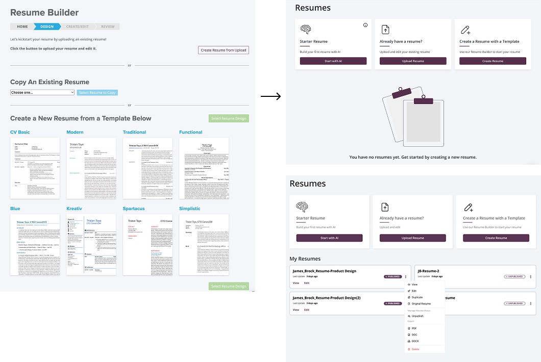
Without changing the builder, we would be able to capture resumes from users with polished resumes to be searched by our employer list.
Reducing the friction when uploading a resume and keeping the user in context keeps the user from getting frustrated.
Due to the small size of the change, and that the index page needed to be migrated from our old EmberJS framework to react, we decided to proceed with the changes and test in a controlled environment with a selection of users.
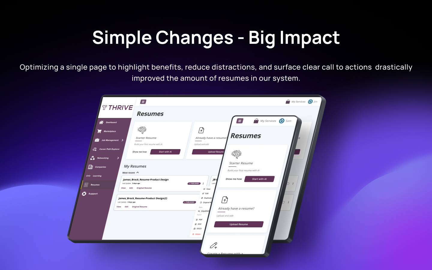
Overall, the proposed changes tested well with minimal pain points and we rolled it out to the entire platform. We saw a drastic increase in users uploading a resume. Now over 70% of our users have either uploaded or created an email on our platform.
With these positive results and users uploading a variety of resumes, this led us to create resume states that users can manage. Users would be able to toggle whether they would want a specific resume to be viewed by employers, or not.